Kantaar
Branding
Brand Identity Design of an Art Exhibition
Exhibition Branding | Artist Branding |
Event Design | Logo Design
About the Project
We developed a visual identity for an artist ‘Amit Wagh’ for his fine art exhibition, built around his artistic journey through the forests surrounding the Krushnaa River in Maharashtra, India, where he has spent over 15 years creating and documenting his work.
My role covered the branding and communication design for both the artist and the exhibition. This included designing the exhibition logo, developing the artist profile, and creating promotional video content to support outreach and audience engagement.
From identity design to exhibition collateral, I worked across every touchpoint of the visitor experience. The process began with establishing a strong visual language – from typography and logo design to the overall look and feel of the exhibition—ensuring consistency across all physical and digital materials.
The visual identity was designed to complement the character and detail of Amit’s artwork, resulting in a refined and cohesive brand presence. The scope of work extended across a wide range of exhibition materials, including signage, catalogues, brochures, invitations, visiting cards, display boards, artwork labels, price lists, easel prints, thank-you notes, packaging tape, and digital and print promotional posters for colleges and other outreach activities.
Here’s how it turned out…
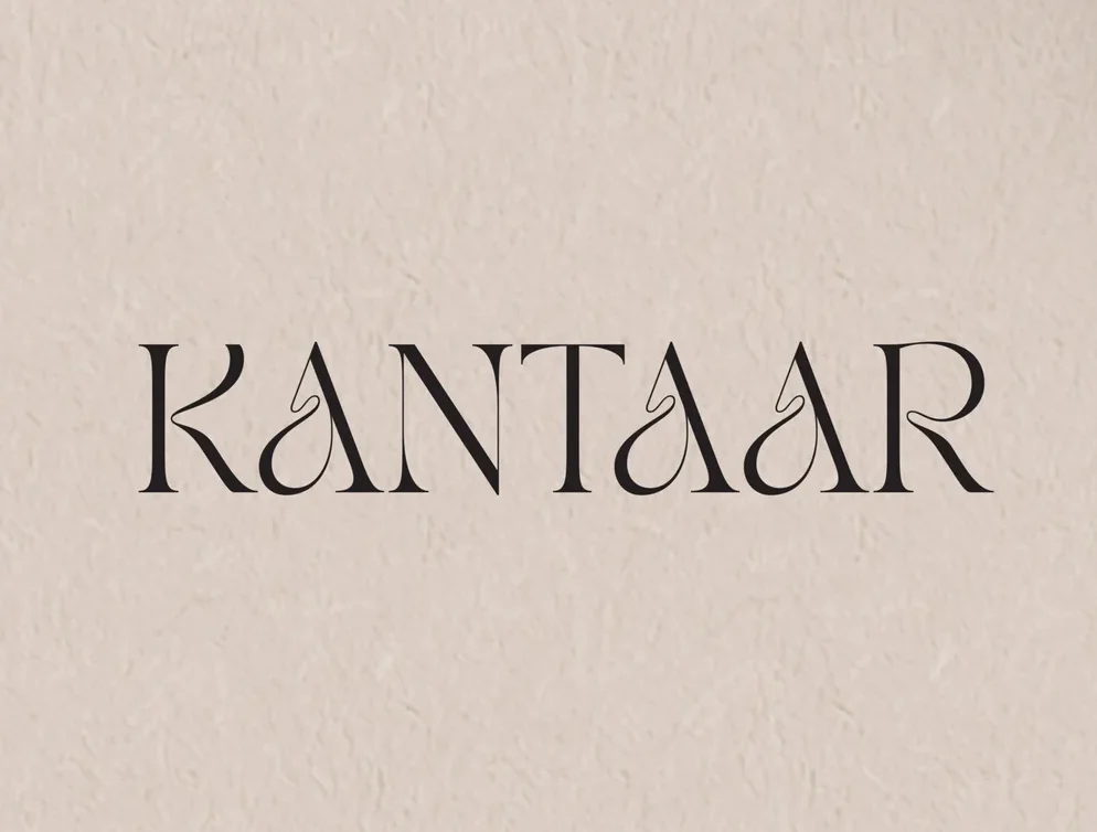
Logo Design for the Event – It was designed considering the essence of Amit’s Paintings
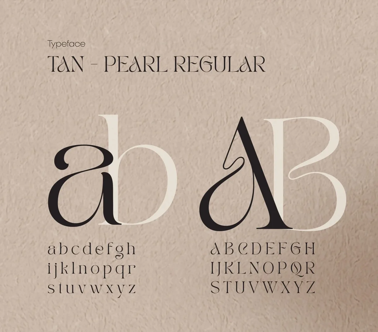
Typeface used for designing the Logo
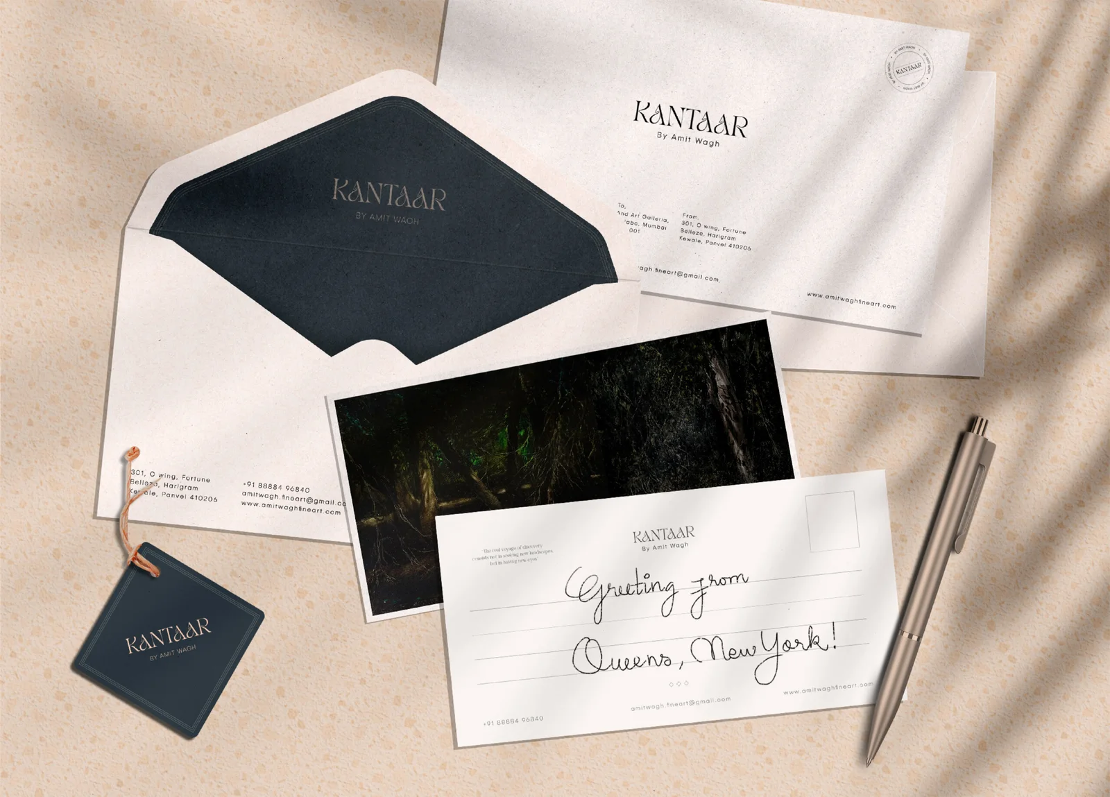
Letter Card Design were designed as a “Thank-you Note” to the buyer, which included a picture of the painting on it too.
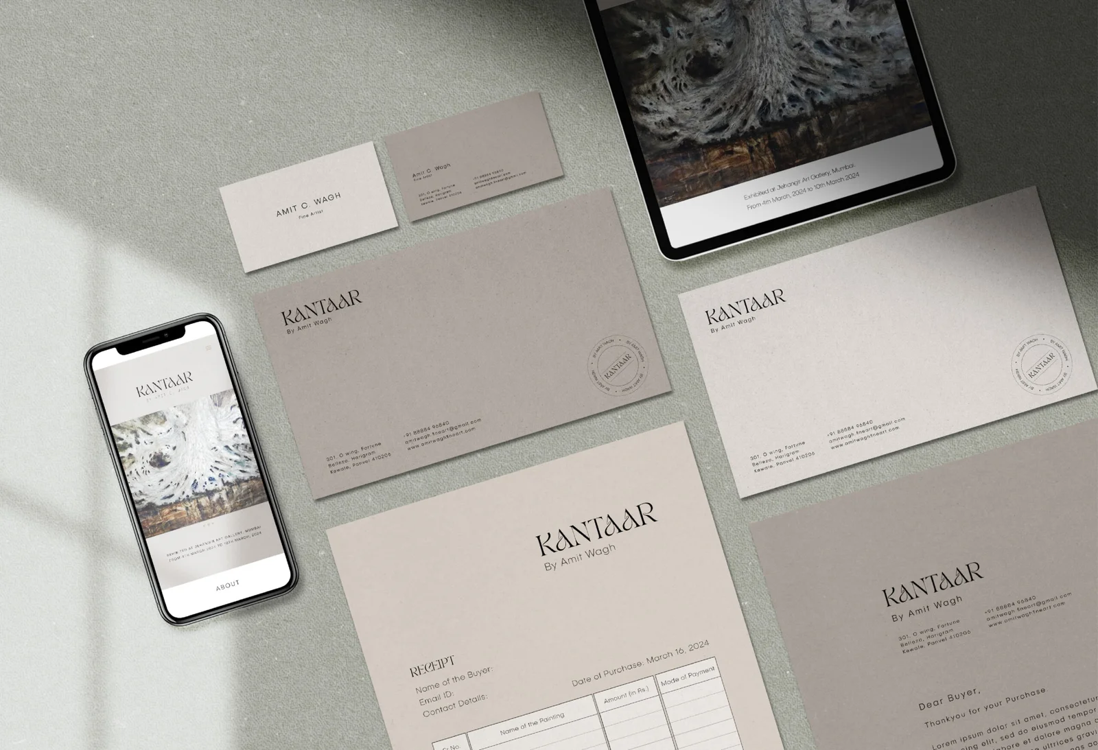
Identity Design- Envelope, Invoice, Business Card, Letterhead, etc.
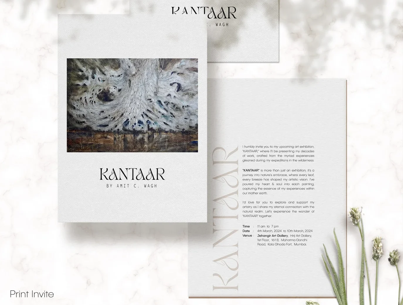
Event Invite- Printed for personal invitations
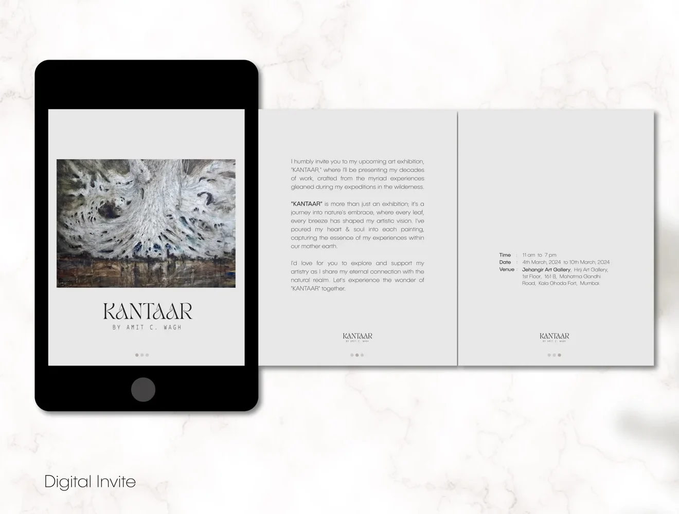
Event Invite- Digital-shared on social platforms
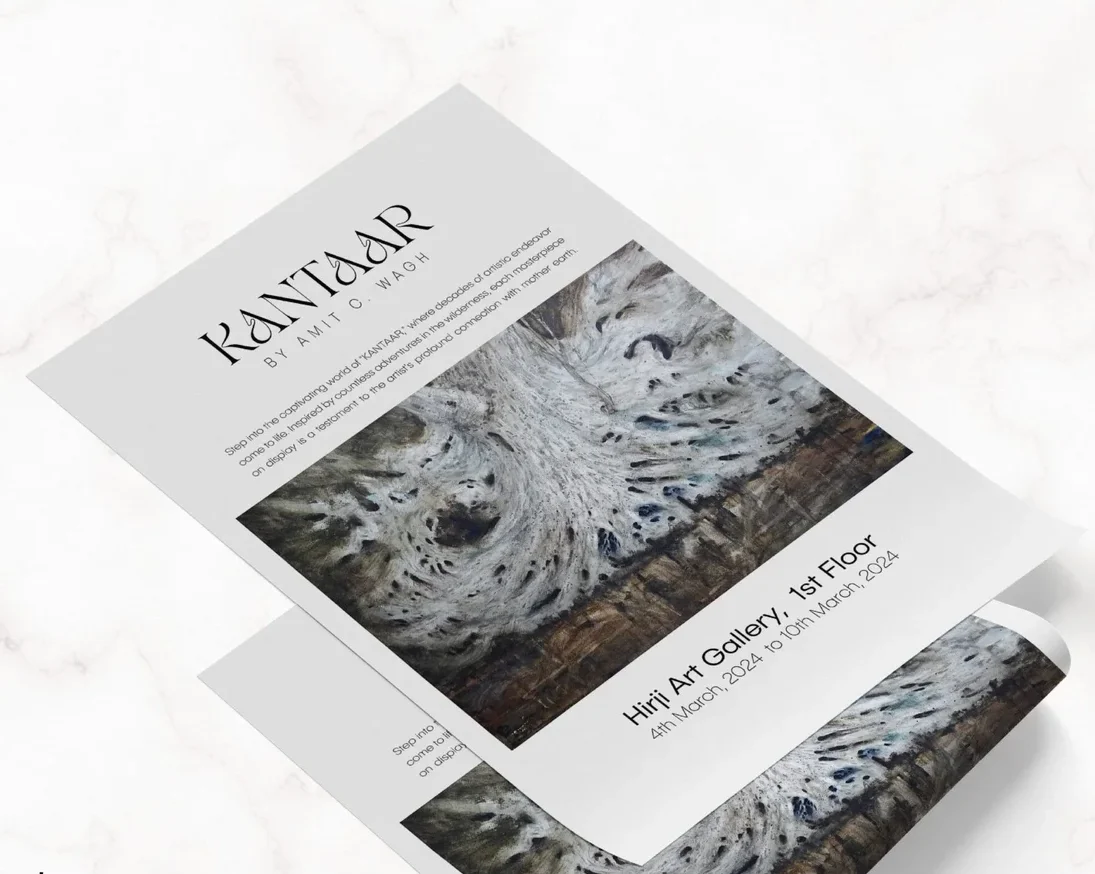
Poster Design- Printed and displayed at Art Galleries and Art Colleges
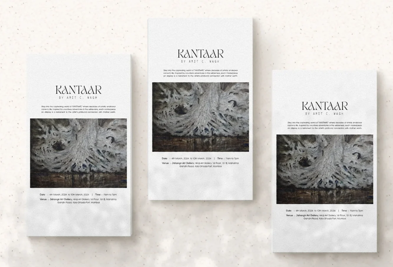
Poster Design- Printed and displayed at Art Galleries and Art Colleges
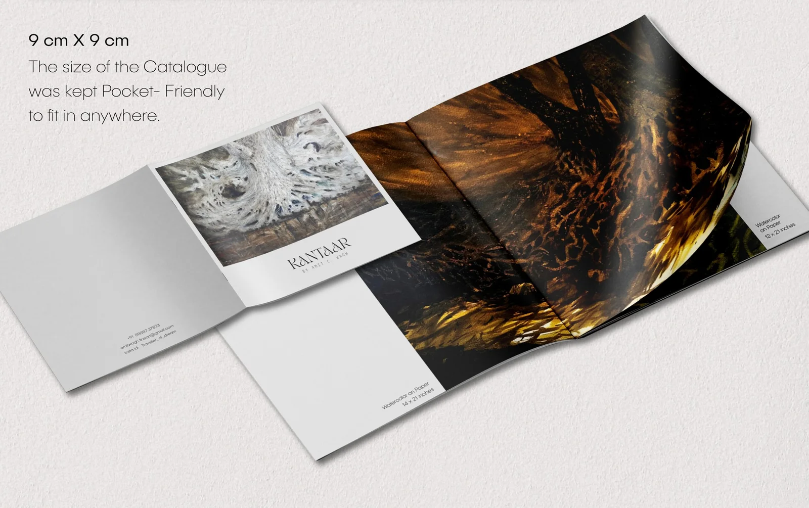
Catalogue Design – Created for internal reference at the gallery and as a keepsake for art enthusiasts to take home.

Easel Print- Used to redirect art enthusiats towards th art gallery
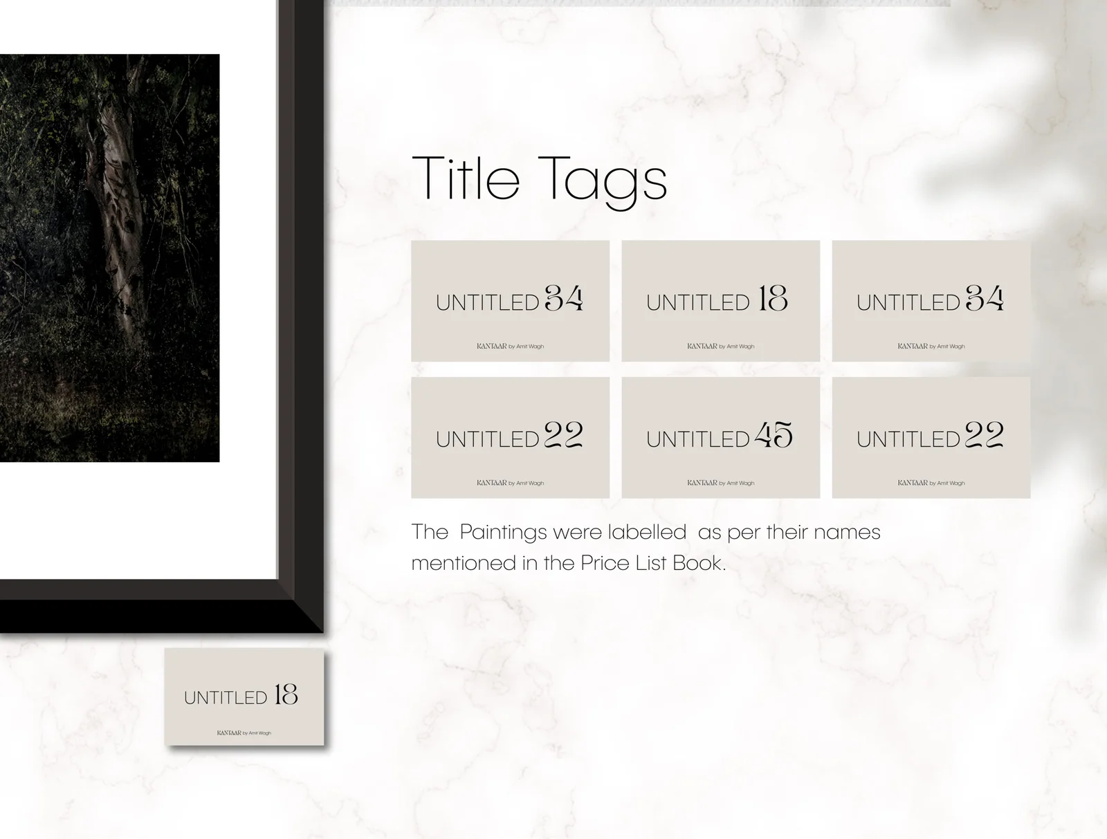
Title Tags – Displayed the Titles of the Painting for easy reading and identifying of the paintings.
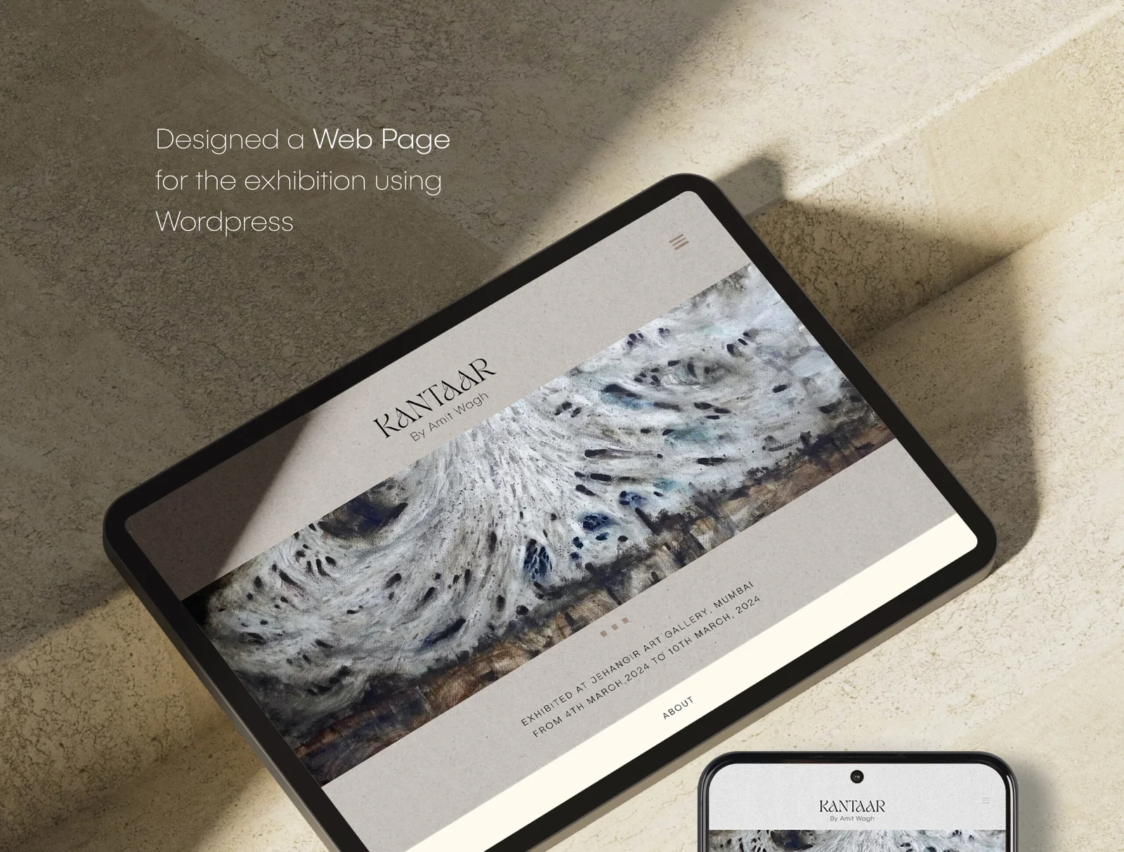
Webpage design for the exhibition – it displayed all the paintings from the catalogue (a digital version of the printed catalogue). It was a single page which included the main paintings and the artist profile, along with the CTA. It was used for advertising as well.
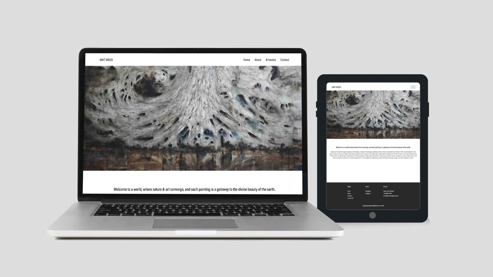
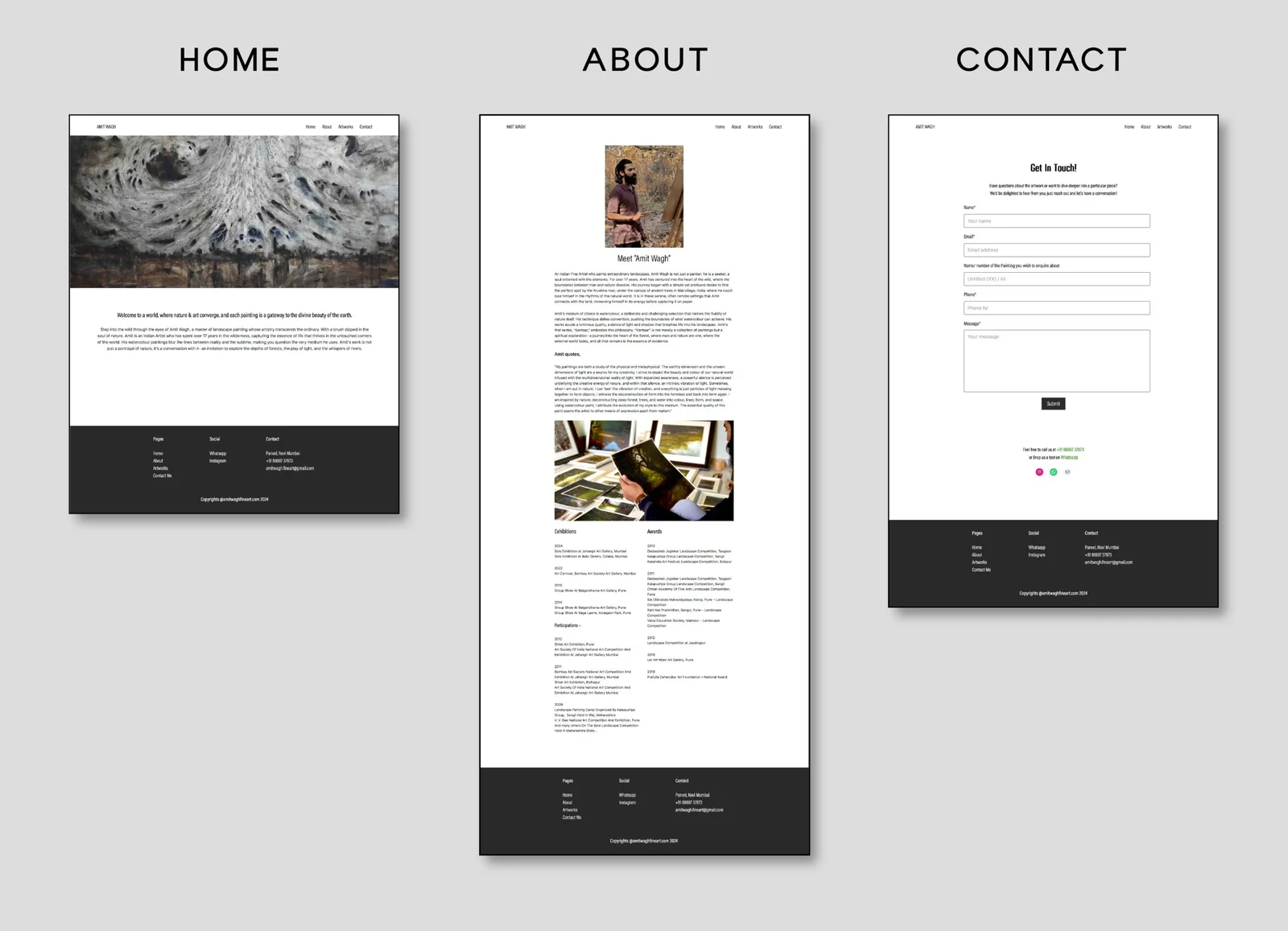
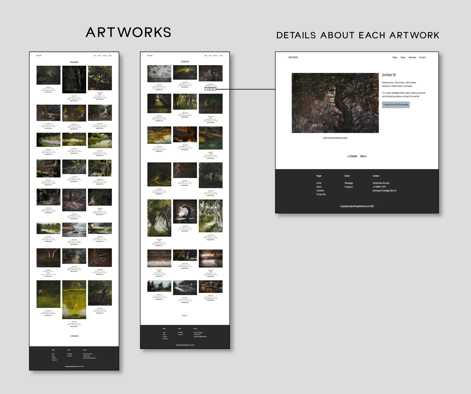
Amit Wagh’s Website Design
Working Structure:
- Generated and Framed content for the webiste:
Took Artist’s interview to understand his approach towards his work - Brainstorming: Worked on the requirements and communication for the user
- Flowmap: Created a flow map using a resulted data from the previous research
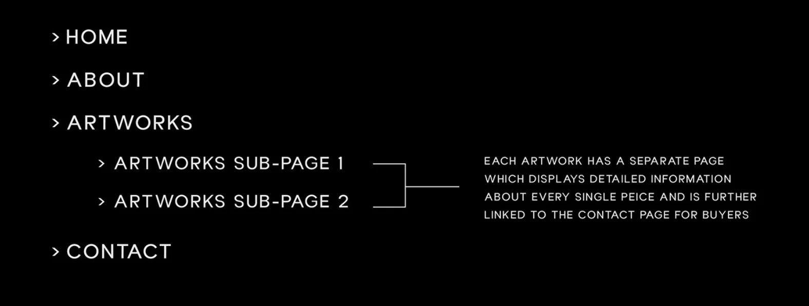
- Picked the look: Designed the look and feel of the website ie. the colors fonts and layouts used
- Draft Stage: Designed a draft look using WordPress
- Final Look: Finalised all the pages and naviagated them correctlt for a user-friendly experience