TopClub
Gaming
Jersey Design | Home Jersey |
Away Jersey
About the Project
TopClub Gaming is a US based company. When the game was launched, we collaborated and created a distinctive set of home and away jerseys that would visually represent the idea of a connected world. The objective was to design apparel that felt global, dynamic, and instantly recognizable within the game’s digital environment.
Here’s how it turned out…
A glimpse into a few of the jersey design experiments…
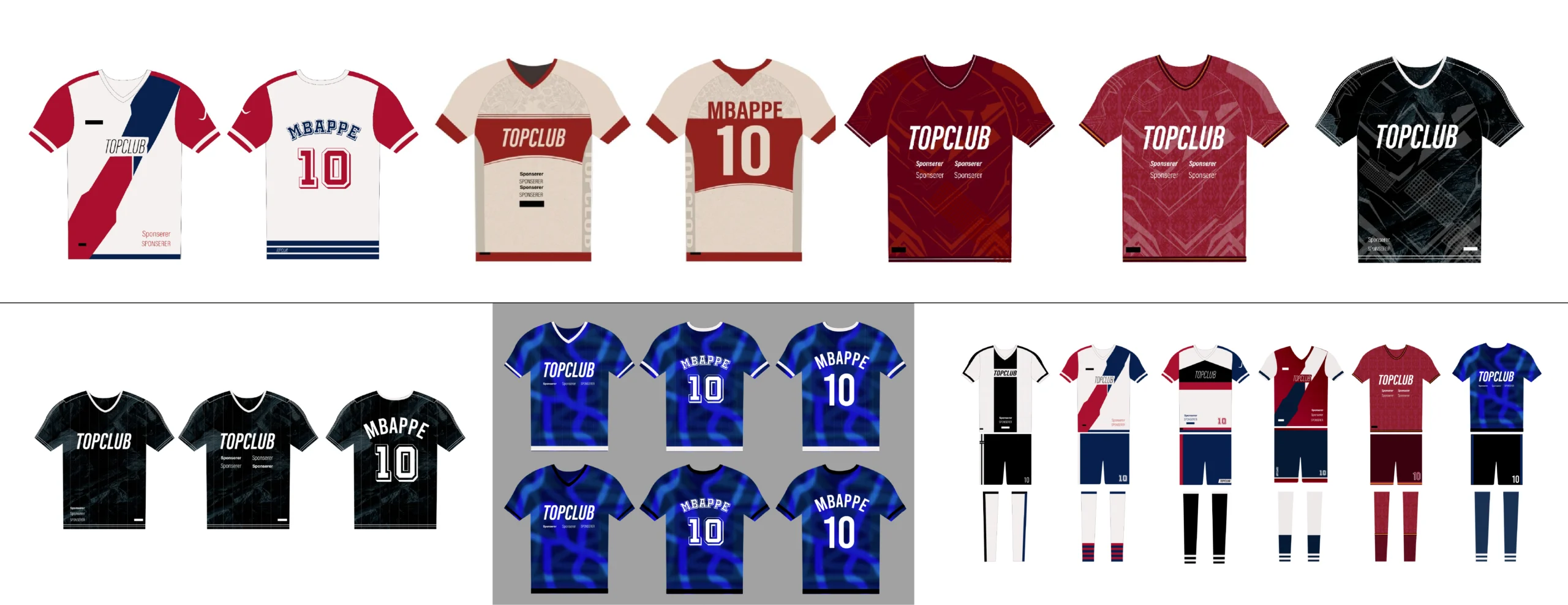
After countless sketches, colour explorations, and jersey variations,
we finally arrived at the designs that made the cut.
Home Jersey Design
Designed as a main face of the game.
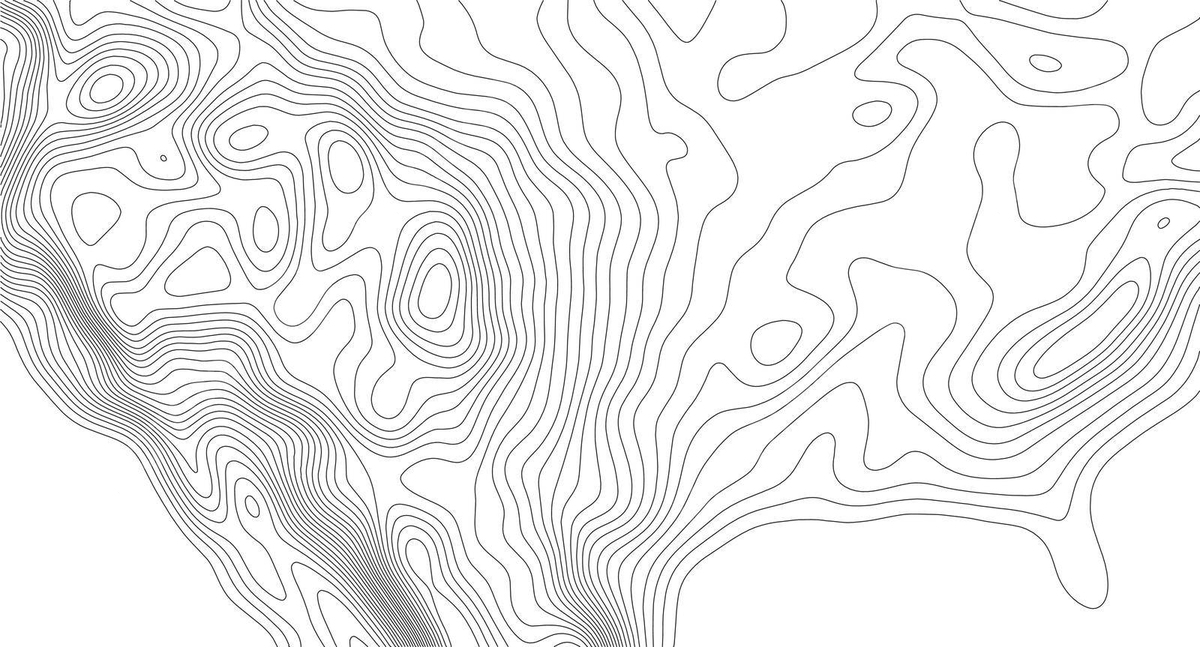
It draws inspiration from topographic contour maps, where flowing lines are traditionally used to represent the natural terrain of the Earth. These geographical patterns were adapted to form a subtle world map across the jersey, creating a visual language that speaks of connection, belonging, and identity.
In football, a home jersey represents where a team comes from – it is a symbol of roots, pride, and the community that supports them. By incorporating the world map through topographic lines, the design expands this idea beyond a single location and celebrates a global home. The contours visually connect continents, cultures, and people, reflecting the spirit of football as a sport that unites individuals across borders.
The continuous lines also create a sense of rhythm and movement, mirroring the flow of the game while adding depth and character to the jersey. As a result, the Home Jersey becomes a representation of both place and connection – a visual reminder that no matter where players and fans come from, they are united by the same passion for the sport.
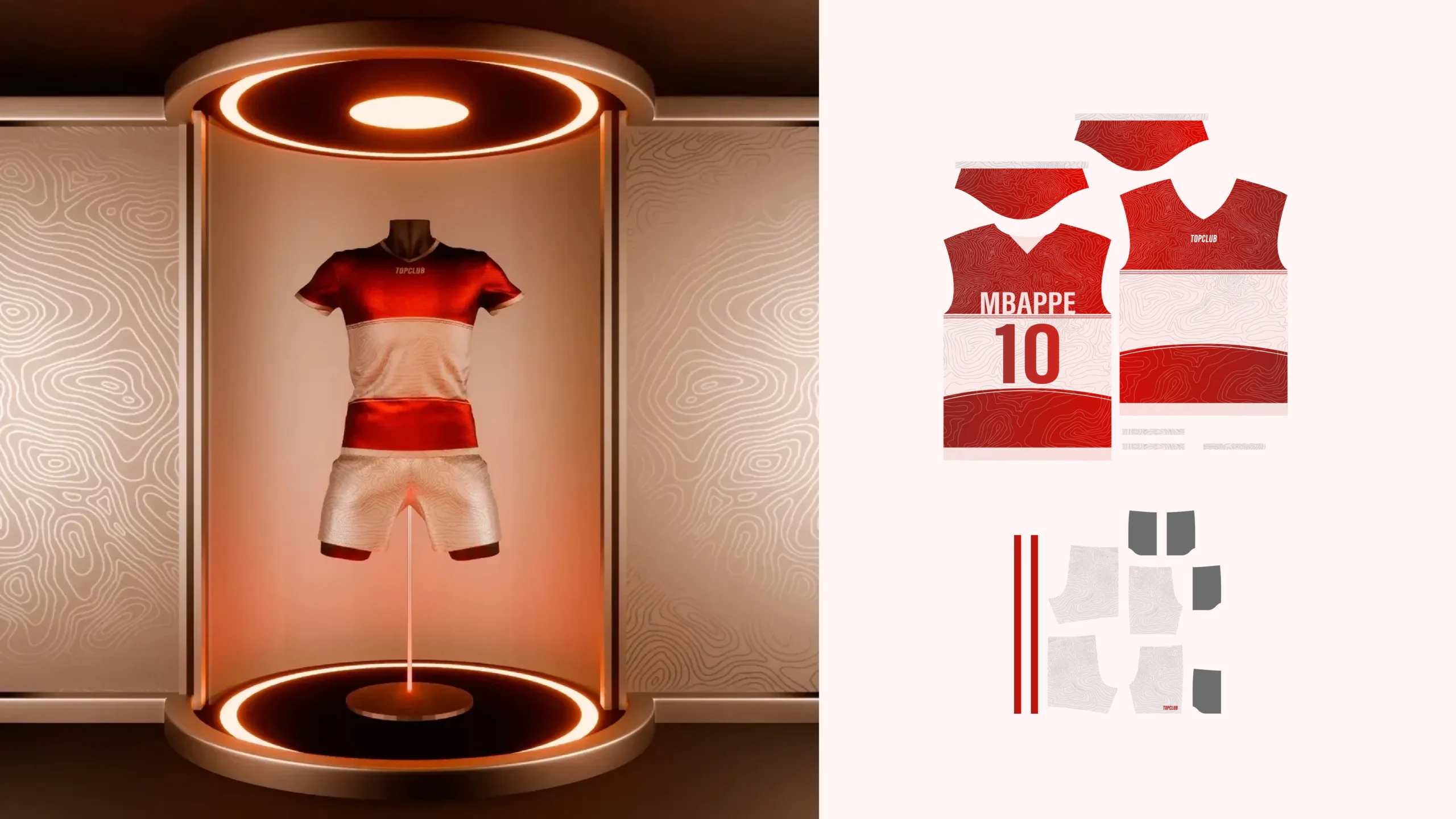
“Inspired by topographic maps, the Home Jersey uses contour lines to form a world map, symbolizing football’s ability to connect people across borders. As the home kit represents identity and belonging, the design celebrates the idea that the entire world can feel like home through the shared language of sport.”
Away
Jersey Design
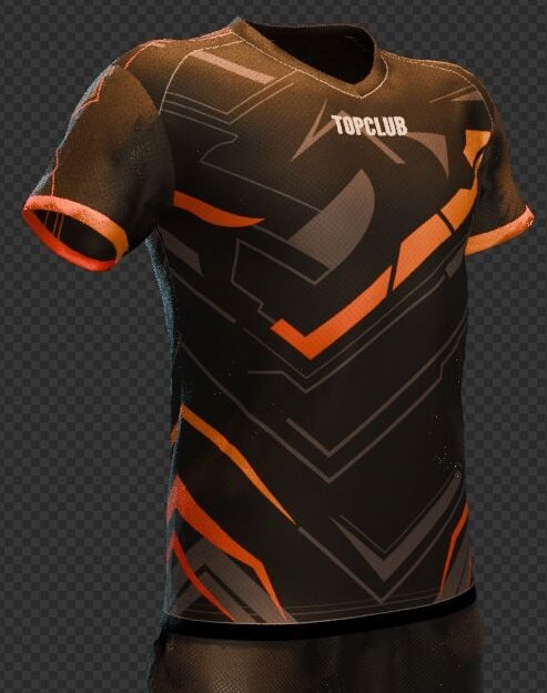
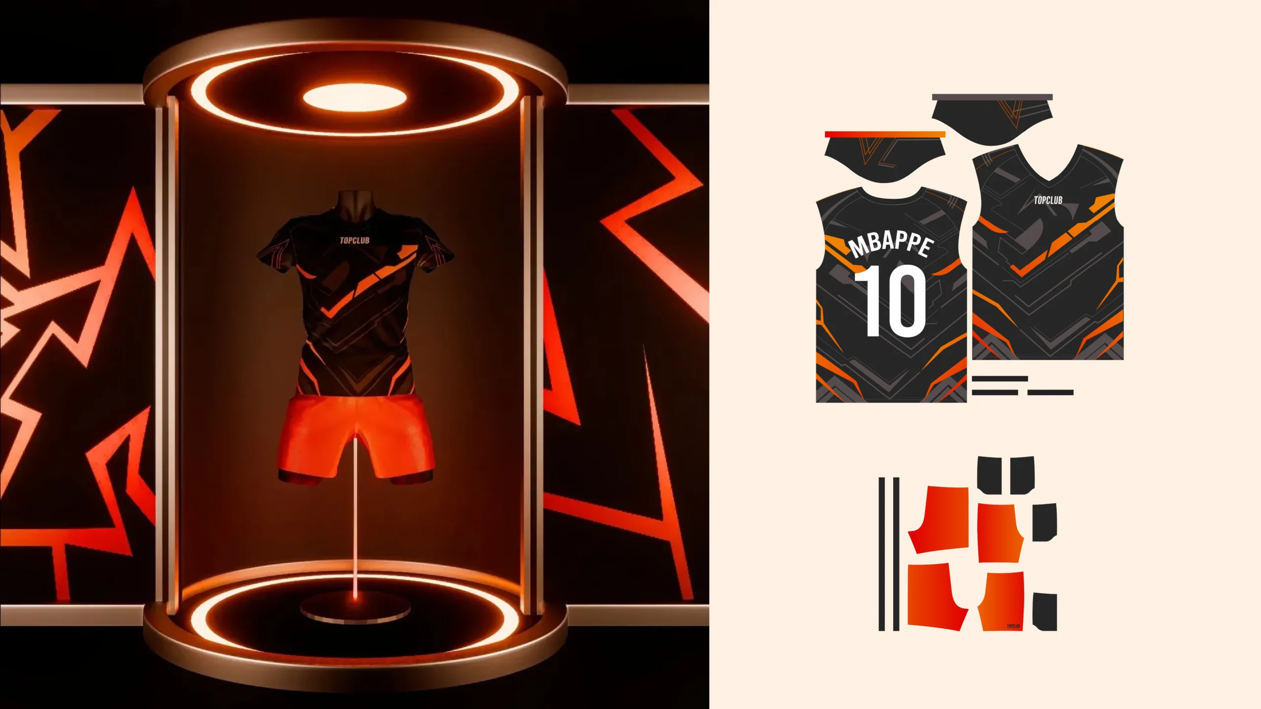
While the Home Jersey focuses on connection and belonging, the Away Jersey was designed to embody energy, confidence, and playfulness. The objective was to create a kit that felt dynamic and exciting without relying on overly vibrant colours.
Inspired by the fast-paced nature of football, the design uses bold angular graphics and layered geometric forms to create movement across the jersey. The sharp patterns mimic speed, direction, and momentum, bringing a sense of action even when the jersey is at rest.
A dark base colour was chosen to maintain a strong athletic identity, while the vibrant orange accents introduce contrast and personality. This balance allows the jersey to feel playful and energetic while remaining visually refined and game-ready.
The result is an Away Jersey that captures the competitive spirit of football—modern, expressive, and designed to stand out both on the pitch and within the digital world of TopClub.
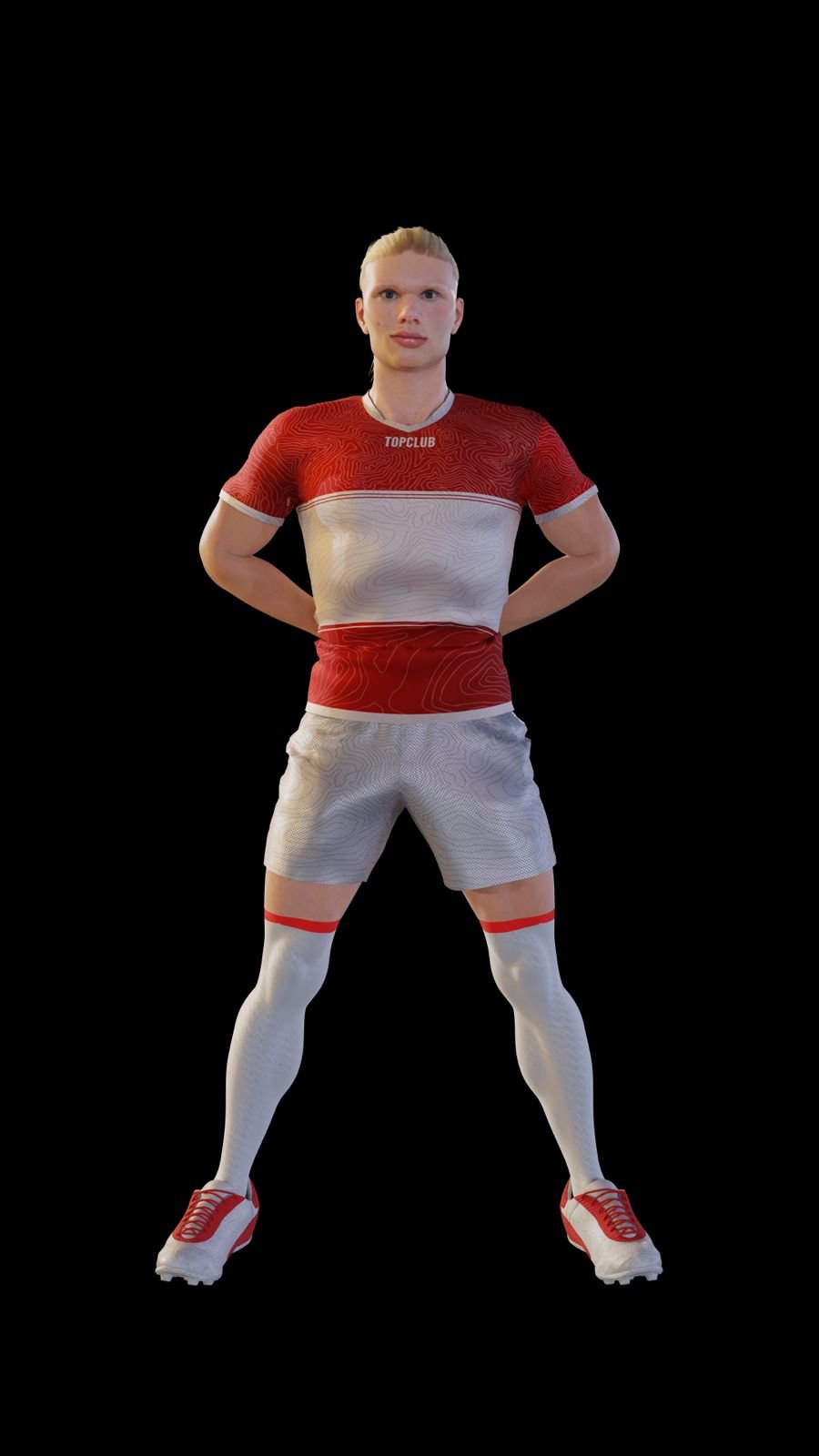
The final jersey designs were integrated onto the game’s 3D player models, bringing the concepts to life within the virtual football environment. These digital assets were further utilized across promotional campaigns, social media content, and marketing materials, ensuring a consistent visual identity both in-game and across external brand communications.
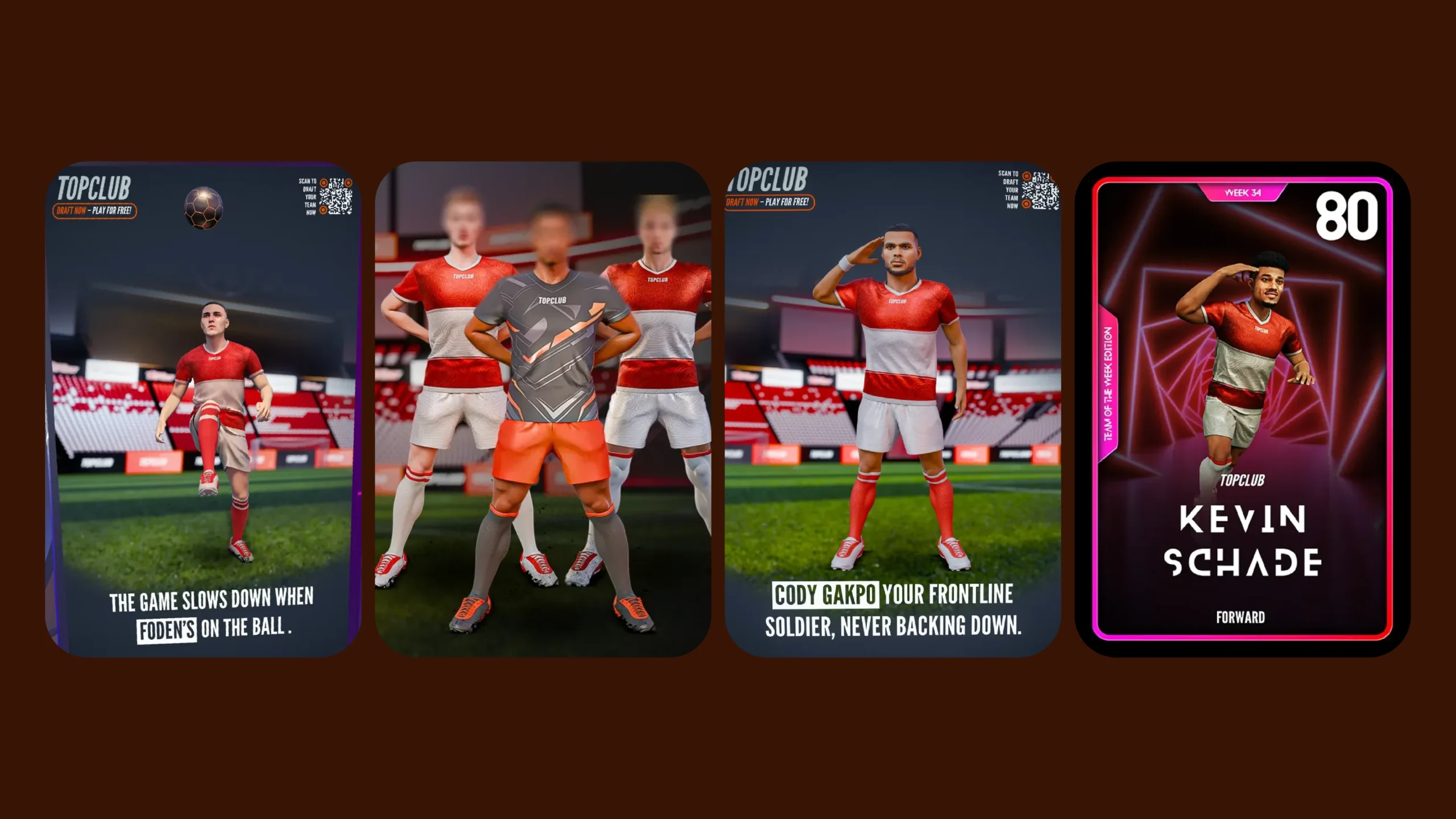
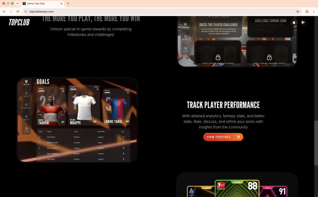
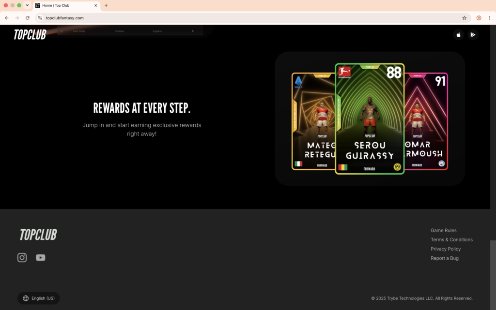
*All the promotional visuals were taken from TopClub Gaming’s social media profile.