Yin & Yummy
Identity Design | Branding
Packaging Design | Brochure Design
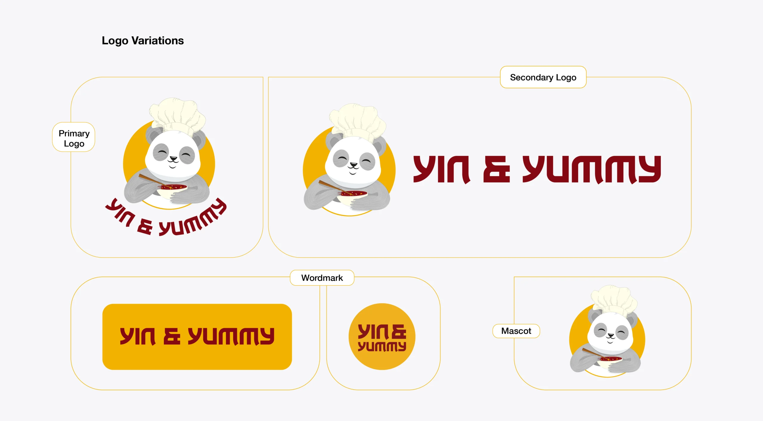
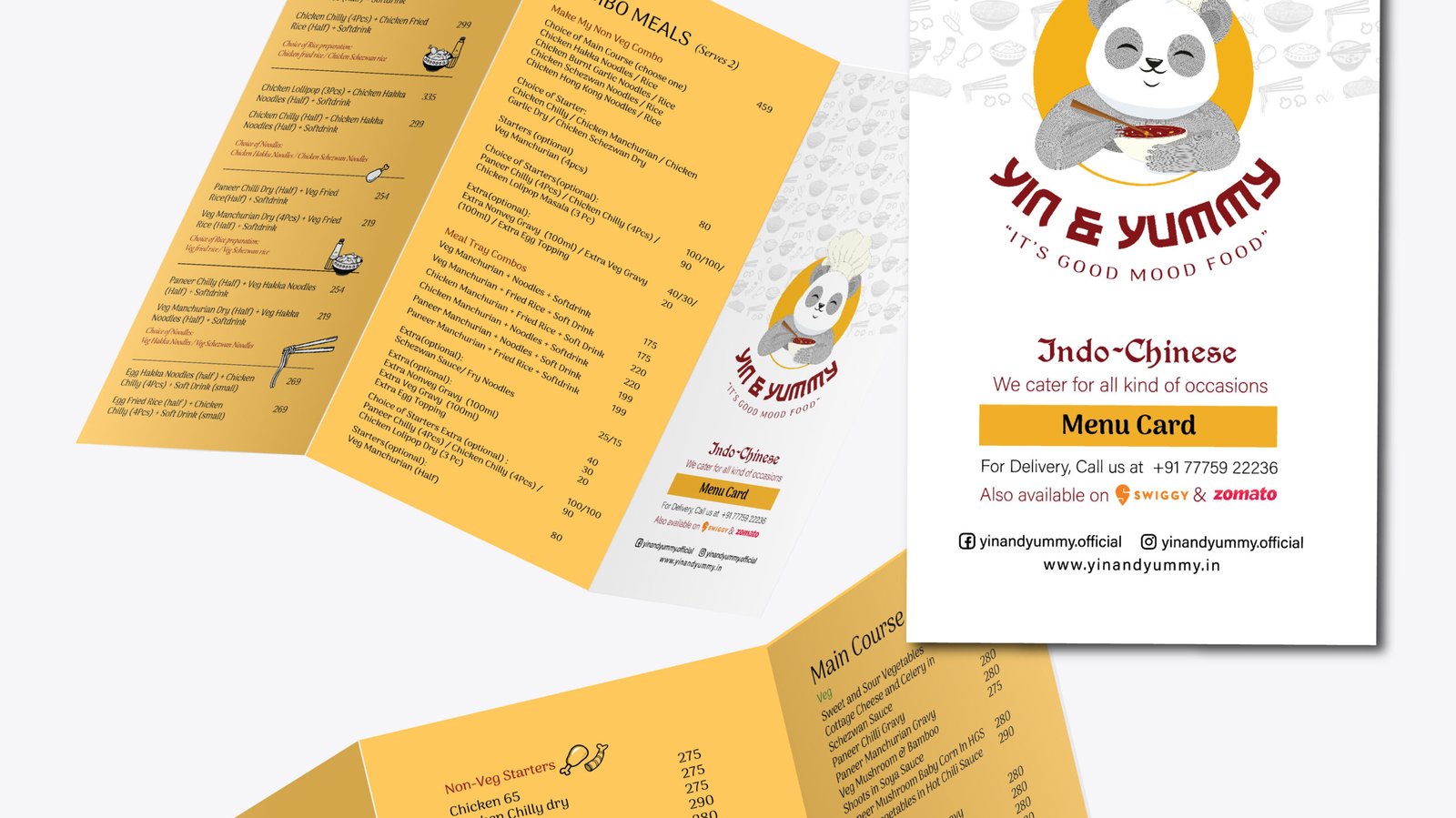
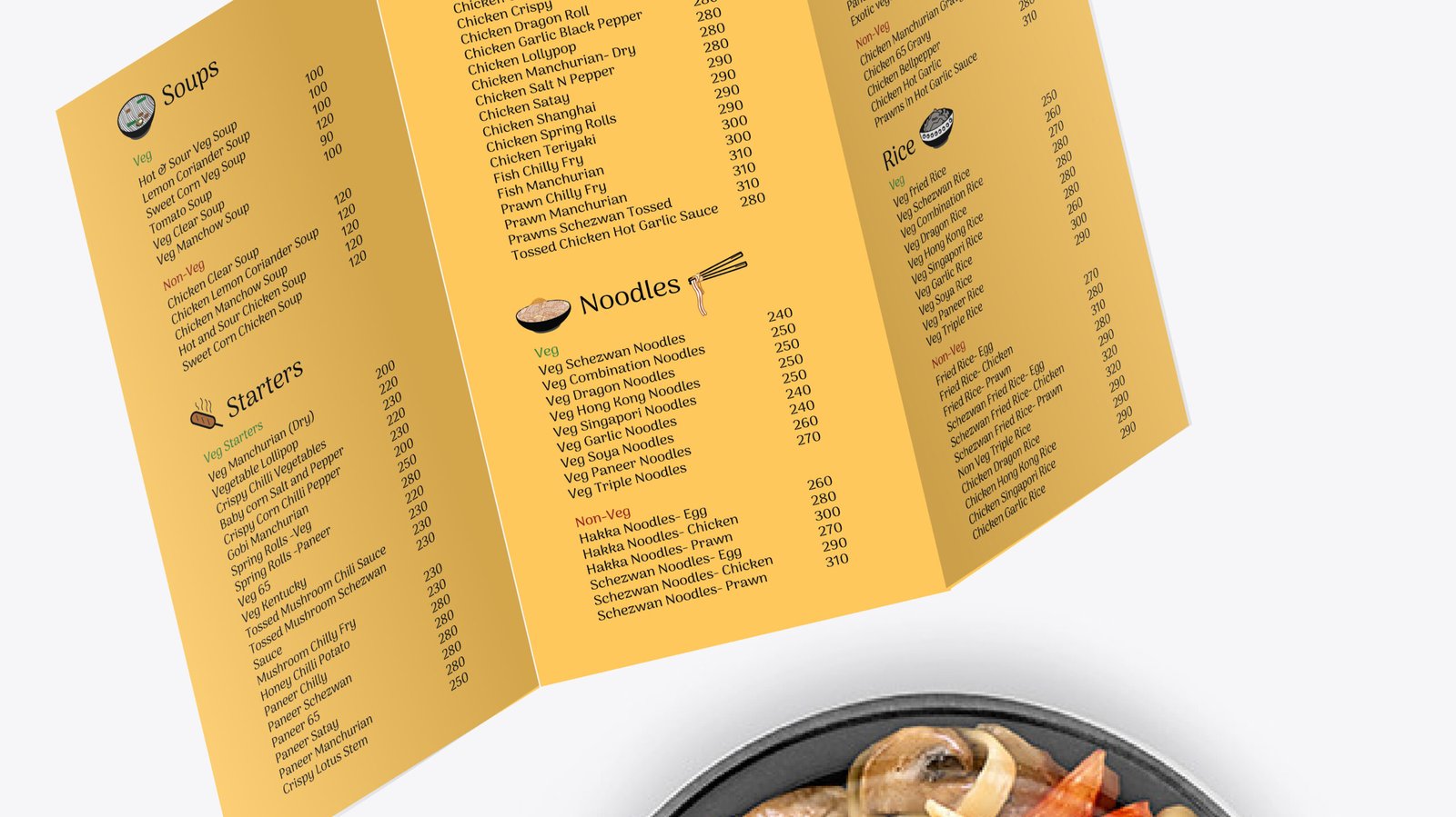
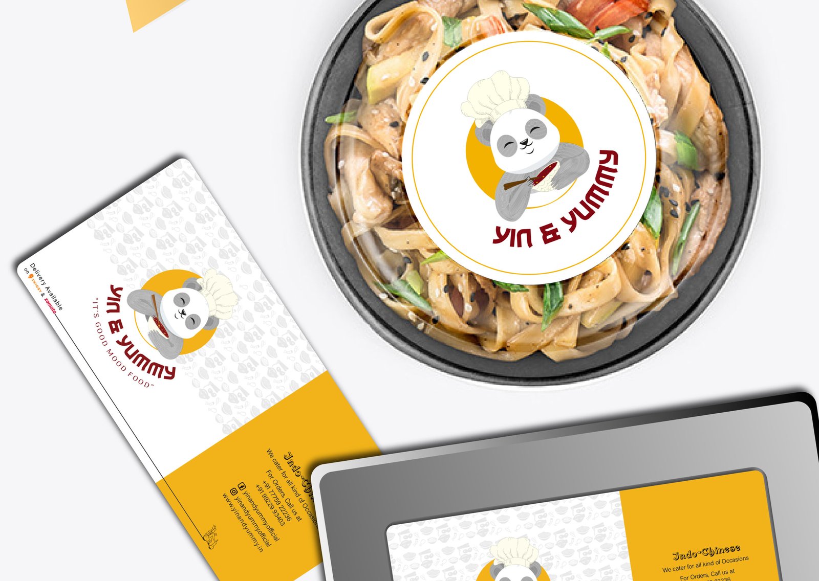
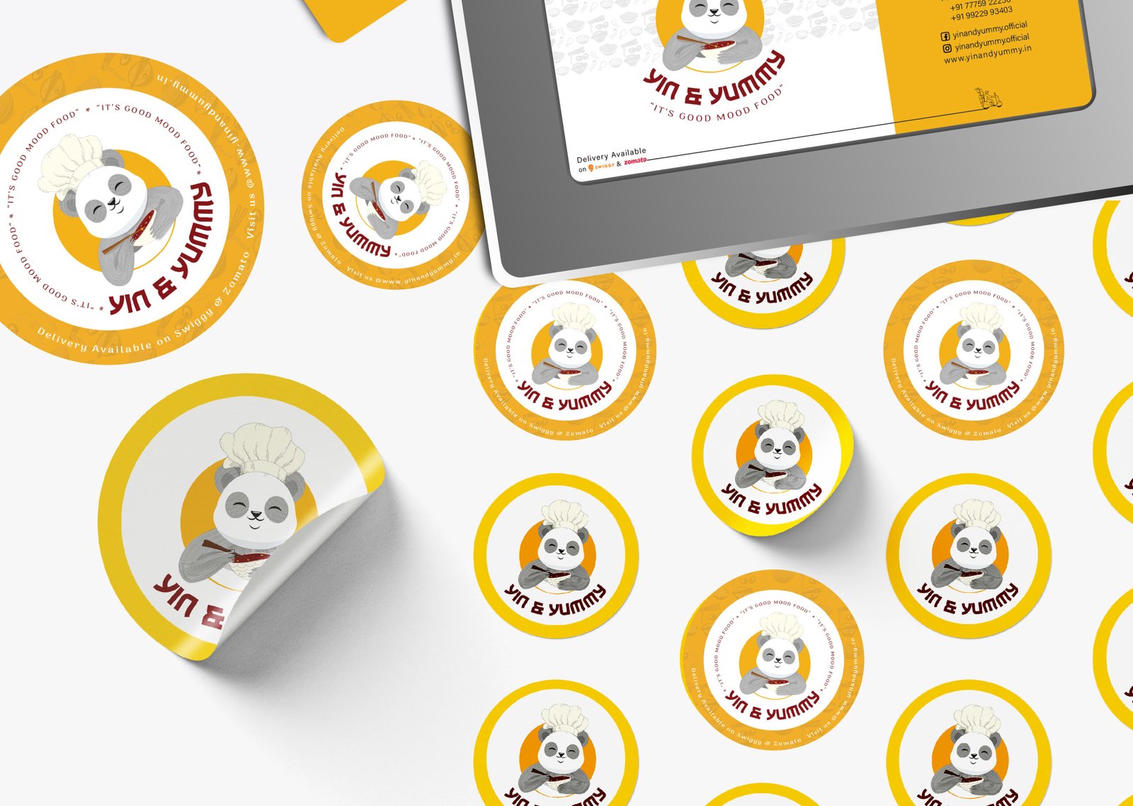
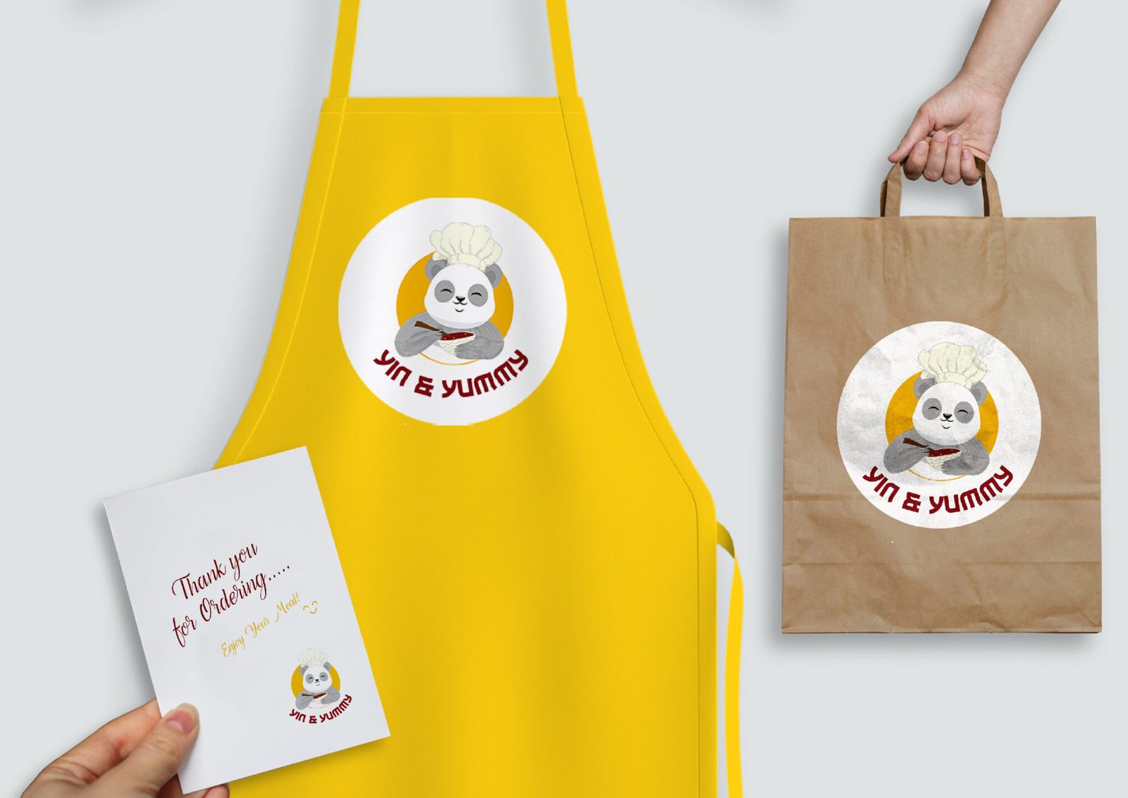
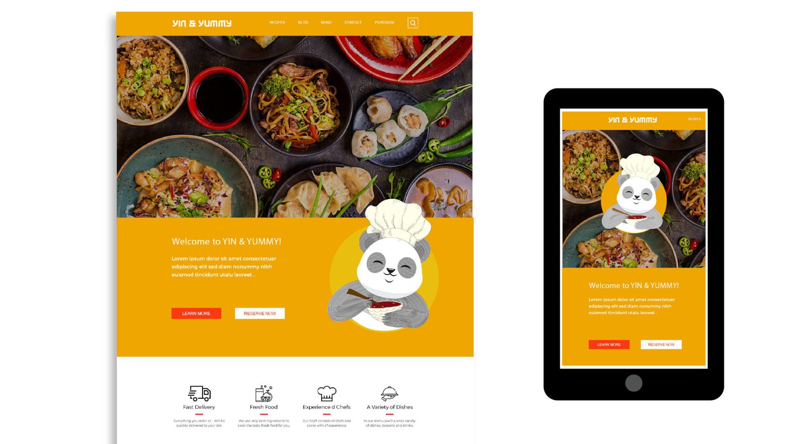
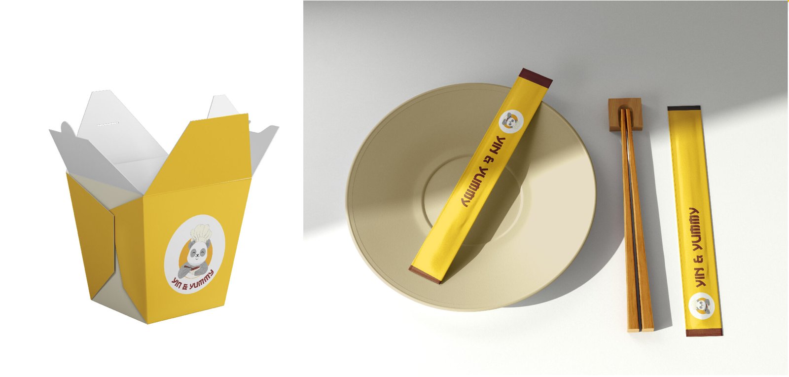
This project involved developing the complete brand identity for a Chinese cuisine cloud kitchen based in Pune. The scope extended across multiple touchpoints, including logo design, mascot development, packaging design, menu design, and supporting brand collateral.
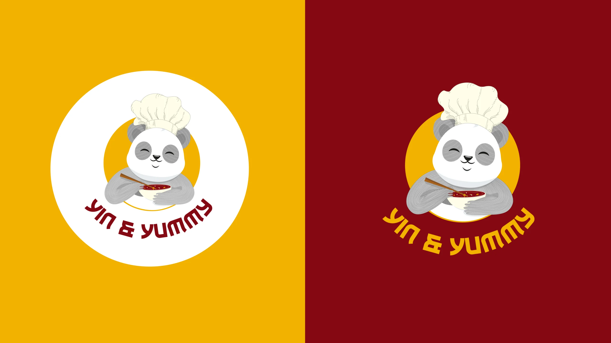
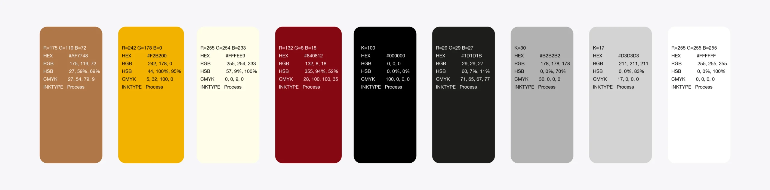
The visual identity was built around a vibrant red and yellow palette, drawing inspiration from both Chinese culture and food psychology. Red, a colour often associated with appetite, energy, and Chinese heritage, became the dominant brand colour, while yellow added warmth, curiosity, and a sense of friendliness. Together, the palette created a bold and memorable presence that reflected the brand’s lively personality and cuisine.
The objective was to create a cohesive identity that felt approachable, distinctive, and instantly recognisable across both digital and physical customer experiences.
Logo Design
Breakdown
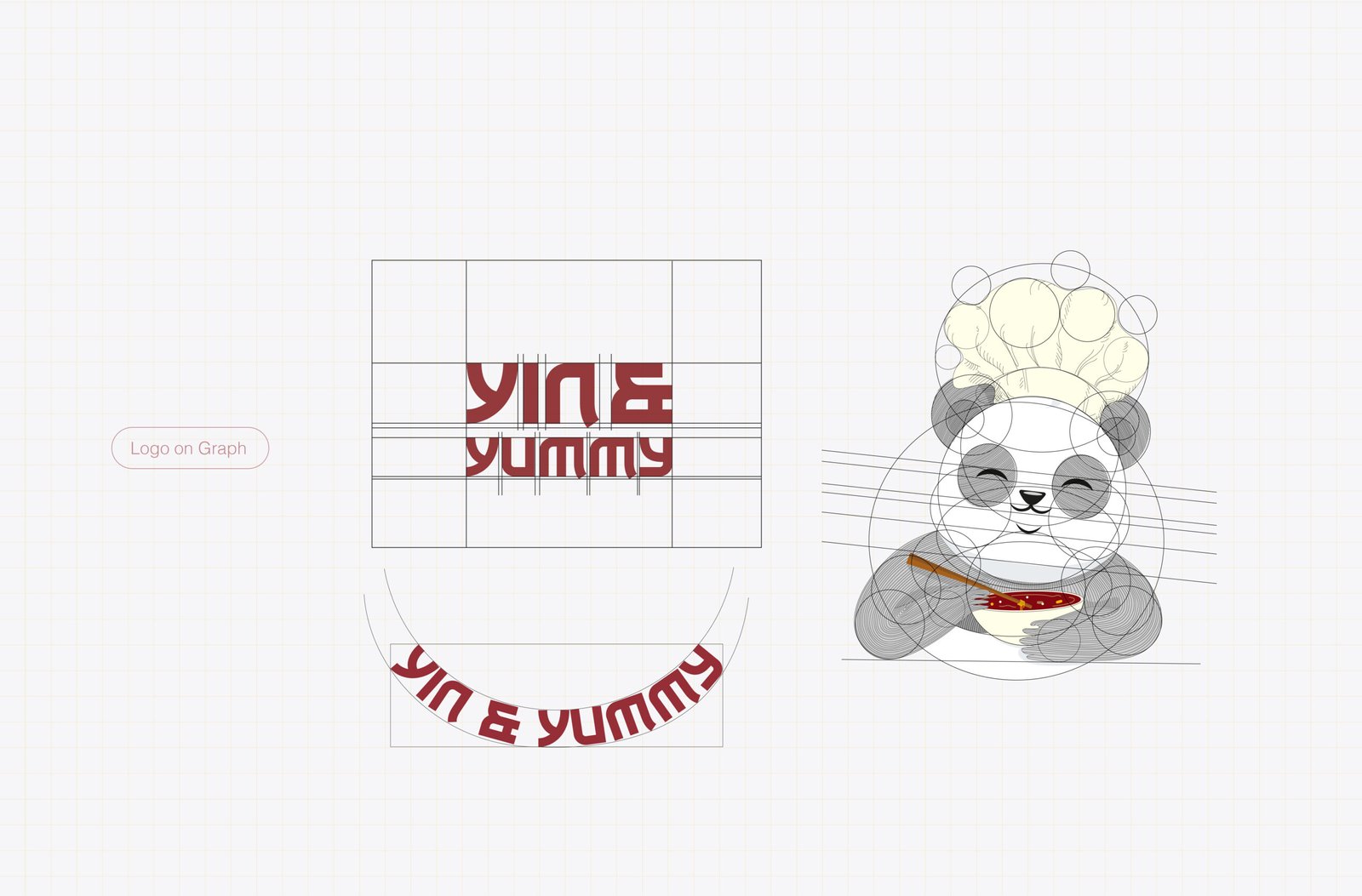
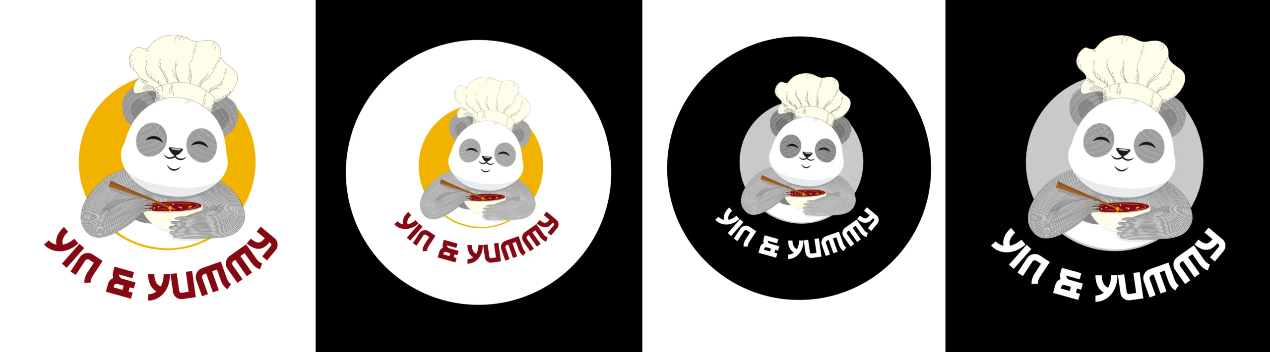
The client wanted the brand identity to feature a mascot and already had a name that carried a distinctly East Asian character. Since the brand was associated with Chinese cuisine and culture, a panda naturally emerged as a strong visual direction. The challenge, however, was to create a mascot that felt playful and approachable while maintaining a professional appearance.
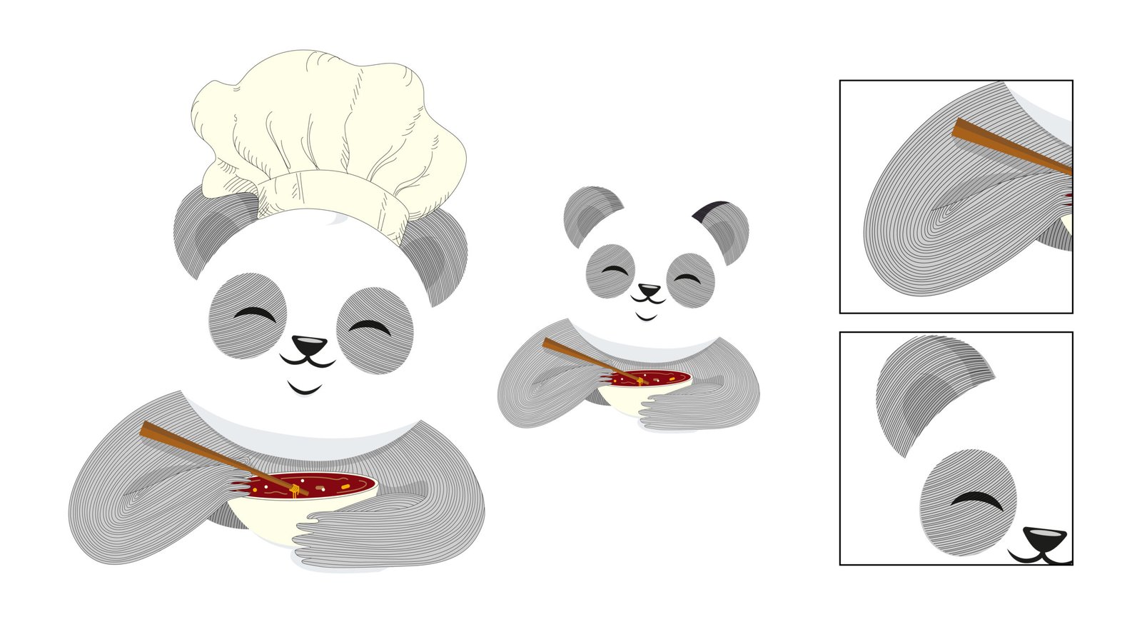
A key requirement was to avoid the conventional depiction of a panda with large black-filled areas, as this made the character appear visually heavy and overly illustrative. To achieve a lighter and more contemporary look, the mascot was developed using linework rather than solid fills. This approach gave the character greater flexibility, clarity, and personality while aligning with the brand’s overall aesthetic.
One of the visual references presented during the exploration phase featured a similar line-based illustration style, which helped establish the direction that was eventually refined and presented to the client.